
Edit: It turns out that, as expected, someone has indeed thought of this idea before. What I am suggesting is at least very similar to the definition of a credible interval, something used quite often in Bayesian statistics. See https://en.wikipedia.org/wiki/Credible_interval. See the original post below.
Original post: I never really tried to make a contour plot before. I’ll gladly admit to that as I am not very fond of them. However, recently, I had to present some results that involved Monte Carlo simulation of a bivariate probability distribution. For this, even I will admit that a contour plot is a decent choice. I was not too satisfied with the way in which a contour plot is normally drawn, and this led me to (re?)discover the trick below.
Plotting a basic contour plot of a probability density function with matplotlib gives me something like this:
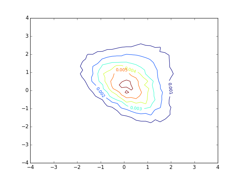
The plot looks decent, but I find myself very unsatisfied with the inline-labels. These denote the value of the function at each contour. However, in the case of a probability density function, these numbers provide little or no insight into the distribution of samples. If the the density function had been larger and the extent of the axes were adjusted correspondingly, the plot would look exactly the same, except that the numbers would be different. This does not seem appropriate in my eyes.
I toyed a bit around with different contour-like ways of representing my results, and eventually came up with the following, exploiting the fact that contour lines are closed curves:
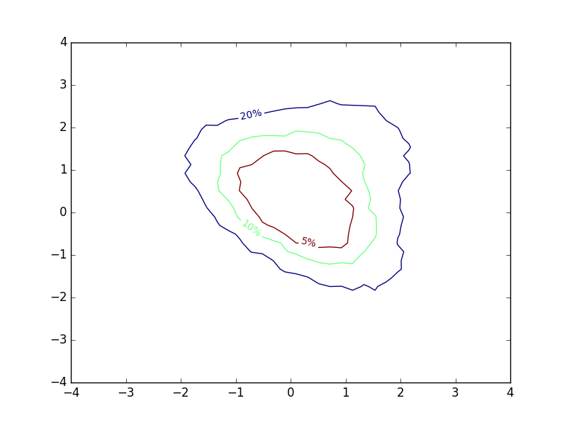
The inline-labels now denote the probability of a sample falling within the area enclosed by the corresponding contours. To me, this provides a lot of intuition about how I should expect samples from the distribution to land. The plot is not much more complex to make than a regular contour plot. I computed different percentiles of my simulation grid, and used these values to determine the locations of contours. Then I swapped the normal contour labels for the percentiles I used.
It seems unlikely that no one has thought about this before. I did, however, not manage to find any literature describing something like this.
The Python code for both plots is given below:
import numpy as np
import matplotlib.pyplot as plt

def pdf():
if np.random.rand() < 0.4:
x = np.random.multivariate_normal([1,0.5], [[1,0.1],[0.1,1]])
else:
x = np.random.multivariate_normal([0,0], [[1,-0.6],[-0.6,1]])
return x

if __name__ == '__main__':
# Parameters
N = 100000
lims = [-4.0, 4.0]
res = 40

# Estimate PDF
pts = np.zeros((2,N))
for i in xrange(N):
pts[:,i] = pdf()
t = np.copy(pts)
pts = (pts - lims[0]) * res / (lims[1] - lims[0])
pts = np.round(pts).astype(np.int)
pts[pts<0] = 0
pts[pts>(res-1)] = res - 1
Z = np.zeros((res,res))
for i in xrange(N):
Z[pts[0,i],pts[1,i]] += 1.
Z /= N * (lims[1]-lims[0])**2 / res**2

# Plot the result as a basic contour plot
plt.figure()
x = np.linspace(lims[0],lims[1],res)
y = np.linspace(lims[0],lims[1],res)
X, Y = np.meshgrid(x,y)
CS1 = plt.contour(X,Y,Z)
plt.clabel(CS1, inline=True, fontsize=10)
plt.show()

# Plot the result as a contour plot with "contained percentages"
lvls = np.percentile(Z.flatten(), (100.-5., 100.-10., 100.-20.))
plt.figure()
x = np.linspace(lims[0],lims[1],res)
y = np.linspace(lims[0],lims[1],res)
X, Y = np.meshgrid(x,y)
CS2 = plt.contour(X,Y,Z, levels=lvls)
fmt = {}
strs = [ '5%', '10%', '20%' ]
for l,s in zip( CS2.levels, strs ):
fmt[l] = s
plt.clabel(CS2, inline=True, fmt=fmt, fontsize=10)
plt.show()